junior works
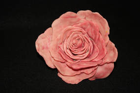
"She Loves Me Not", 2017, 5"x3"
This rose was my first attempt at 3D sculpting. It is made out of Sculpey clay. The rose symbolizes love and romance. Each petal was hand sculpted and layered to form the entire piece. This can be compared to true love, and how it can shape you into a better and happier person.
This rose was my first attempt at 3D sculpting. It is made out of Sculpey clay. The rose symbolizes love and romance. Each petal was hand sculpted and layered to form the entire piece. This can be compared to true love, and how it can shape you into a better and happier person.
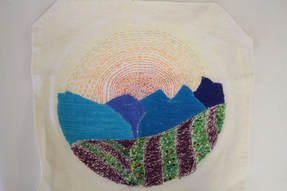
"The Hills Are Alive", 2017,
This piece was a first try with embroidery. I knew I wanted to do a landscape, and I thought embroidery would be a different approach to getting there. I usually paint, but I was trying to go out of my comfort zone. I added beads to the fields to give an impression of flowers. The mountains, sky, and fields were all stitched with different techniques.
This piece was a first try with embroidery. I knew I wanted to do a landscape, and I thought embroidery would be a different approach to getting there. I usually paint, but I was trying to go out of my comfort zone. I added beads to the fields to give an impression of flowers. The mountains, sky, and fields were all stitched with different techniques.
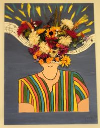
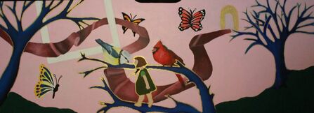
"The Monsters In My Head" , 2017 ,
This piece is a multi media collage. I chose the bright colors in the shirt to match my personality. I really enjoy meeting new people. Also, the bottom is squared off, because it is symbolizing being boxed in and having to fit in with society. Towards the top, the head explodes into beautiful flowers and music. The music notes are representing my love of music, as well as the pretty sounds I hear in day to day life. This piece was meant to express lots of emotion and evoke an exciting feeling.
This piece is a multi media collage. I chose the bright colors in the shirt to match my personality. I really enjoy meeting new people. Also, the bottom is squared off, because it is symbolizing being boxed in and having to fit in with society. Towards the top, the head explodes into beautiful flowers and music. The music notes are representing my love of music, as well as the pretty sounds I hear in day to day life. This piece was meant to express lots of emotion and evoke an exciting feeling.
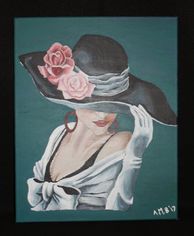
"Eleanor" , 2017
This piece was done specially for the cover of Sasee Magazine. I have always loved the magazine because of their recognition of local artists. Over the summer, my mom gave me the idea to contact the editor and see if I could enter a piece to be on the cover. I did, and this piece was on the January issue of the magazine. It is entitled Eleanor because I think of that name as very proper, which goes nicely with this prim and proper lady. It was done with acrylic paints.
This piece was done specially for the cover of Sasee Magazine. I have always loved the magazine because of their recognition of local artists. Over the summer, my mom gave me the idea to contact the editor and see if I could enter a piece to be on the cover. I did, and this piece was on the January issue of the magazine. It is entitled Eleanor because I think of that name as very proper, which goes nicely with this prim and proper lady. It was done with acrylic paints.
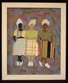
"We're Only Human", 2017,
In this mixed media piece of art, one can see three African American women standing with legs crossed in a row. Each of the women has a different skin tone, and different skirts and blouses. Around the women, there is a poem, called “Human Family,” by Maya Angelou. It is spiraling around the women with alternating colors. Gradually, the words get bigger. The shape of the lines that the words create was intentionally hard to follow. It creates chaos around the central focus: the women, and in turn adds to the overall meaning of the piece. The colors in the words are pulled from the fabrics I used in the women’s clothing. The women are simplistic, because I felt that using lots of values would be too chaotic with the spiraling words.
For the actual creation of the project, I painted the skin of the women and the background in acrylic. I finger-painted the background to create a fun texture. The dresses are made of fabric samples I found. The words were also painted in acrylic. Finally, the faces of the women were drawn in sharpie.
I was inspired to do this project by a couple of different things. The poem “Human Family” is a really special poem to me, and I think it contains a really important message. At this time of corruption, it is truly important to learn to love everybody, no matter their color or shape. I also really enjoy folk art and artwork from the Gullah culture. I tried to mimic that style in this piece, by keeping the values simple and minimalist.
Overall, this project pushed me outside of the my comfort zone more than I would’ve liked. I had really big visions for this project, but my final product did not come out how I expected. I think the craftsmanship could be a little better, and overall the piece would be more engaging and clean.
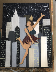
"Keep On Dancin'", 2017
This piece of artwork is of a flapper dancer from the 20’s doing the charleston, with the New York City skyline in the background. The piece is very simplistic, without much use of value. The reason for this is that I wanted the flapper girl to stick out, since this was the focal point. The vertical structures of the buildings, along with the layers, show the height and depth of the city. The actual position of the flapper girl creates movement for the viewer. Emphasis is created by using rich colors for the dancer. She is also raised from the background which definitely draws the eye to her. The unity of the piece is created because the majority of the roaring 20’s fashion and glam took place in New York City, so the dancer and the city scape go well together.
In order to create this project, I used cardboard, fabric, and acrylic paint. I have never worked with cardboard manipulation before, and I didn’t particularly enjoy it. I felt as though the cuts in the cardboard yielded a messy, not precise- looking, project. To create the layers of the city, I peeled away layers of cardboard. I cut around the woman, and only peeled away the layers around her. I painted her with acrylic paint. I then cut different colored and patterned gray scale fabrics. I cut the back flat piece of the cardboard behind the dancer into the silhouette of the New York City skyline. I took an additional piece of cardboard and layered the fabric buildings with the cardboard. I painted the remaining buildings shades of gray and black.
I got my inspiration from a couple of different things. I really enjoy the book “The Great Gatsby,” so that was my inspiration for the theme of this work. As for the New York background, I was inspired by the fact that a lot of glitz, glam, and money is centered in the city. It is the city of bright lights, and I thought emphasizing the flapper dancer would really tie in the style of that time period. Overall, this project was rough for me, as mixed media is not my forte. I believe I will stick to painting in the future.
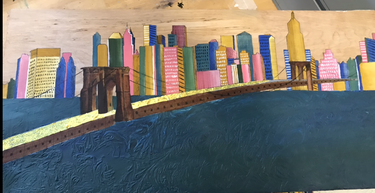
"Brooklyn Bridge", 2017
This painting is an acrylic painting on wood. The subject matter is the Brooklyn Bridge with the New York City skyline in the background. I used the Brooklyn Bridge as the focal point so the perspective and position would draw you into the city. The colors of the buildings add to a bright and happy vibe that the city is known for. I used micron pens to add value to the buildings so that there was more differentiation and detail. The gold wrapping paper was used to draw attention to the bridge. I believe it gives a good contrast to the rest of the work overall. The micron pen detail was a new technique for me, and I think it really enhanced the piece.
My inspiration for this piece came a from a nostalgic feeling I have of being in the city. I grew up in New Jersey, just across the water from New York, so I have fond memories of taking weekend trips there and venturing around. It made me think of the Macy’s Thanksgiving Day Parade the I’ve been to quite a few times. For me, the city was always something special. Going there was always so much fun and so exciting. I didn’t realize it when I was little, but New York City is full of so many amazing opportunities and cool people. The creativity thrives there and the overall mood is great. This painting really reflects those feelings for me. Looking at it takes me back and pulls me into the crowded streets and bright lights.
Overall, I am quite satisfied with this project. I did have some struggle with paint pouring in the water, but that was a happy accident. The texture created by that mistake was super fun and added to the cool vibe of the artwork. I do feel like I could potentially add to this piece in the future, but for right now I believe it’s complete. I had a lot of fun working on it, and I hope the message I was trying to convey can also be seen by viewers.
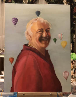
"Beaming Balloons", 2017
This painting is a portrait of my grandfather, Joe. The original photograph was taken by my dad at a hot air balloon festival. I used oil paint, which was a relatively unfamiliar medium for me. I do really like how it blended the colors in the face. The color of the sky is kind of muted, which shows great contrast between the background and my grandfather. At first, I did the natural thing of avoiding the face at all costs. After struggling to get the background color correct, I took a break and started painting the face. After the sky color had dried, I painted over it with the intended color. I tried my best to make the balloons contain fun colors to match the smile of my grandpa.
My inspiration for this piece was to create something for my grandmother for Christmas. I have always wanted to paint a picture of my grandfather, but having this portraiture project made it a perfect idea. I was very scared and intimidated by doing it, only because my grandfather was very special to me, and the thought of messing up his face was scary. I really love this picture in particular because of his radiant smile. You can tell how genuinely happy he is in the photo, and it takes me back to when he used to take me to the balloon festivals in New Jersey. My grandpa was my best friend, and losing him in 2010 was absolutely awful for me. I really wanted to capture him in a positive and happy light, because that’s the kind of man he was. There isn’t a day that goes by that I don’t think about him, and painting this was sort of a coping mechanism for me.
Overall, I am really pleased with how this came out. The only thing I would change about this is the shirt. The shirt he was wearing in the picture was very complicated and I didn’t have much of a reference to go off of for the wrinkles. Other than that, I am super happy with how this portrait came out. I am very excited for my grandma to get this for Christmas.
"Innocent Dreamland", 2018
This piece is one I hold very close to my heart. There is a lot of symbolism embedded in it, and what may seem like a fantastical landscape to others, is actually a glimpse into my soul. An important symbol in my family is the bird. Whenever a member of my family dies, we always say that they come back in the form of different birds. This past January, my grandma, with whom I was very close, unfortunately passed away. In remembrance of the support from my grandparents in both art and music, I wanted to include both of my passions by painting a wooden panel that actually belongs inside a piano. I hope those who view it will relate it to their own lives in the most beautiful of ways. It is still in progress.
This piece is one I hold very close to my heart. There is a lot of symbolism embedded in it, and what may seem like a fantastical landscape to others, is actually a glimpse into my soul. An important symbol in my family is the bird. Whenever a member of my family dies, we always say that they come back in the form of different birds. This past January, my grandma, with whom I was very close, unfortunately passed away. In remembrance of the support from my grandparents in both art and music, I wanted to include both of my passions by painting a wooden panel that actually belongs inside a piano. I hope those who view it will relate it to their own lives in the most beautiful of ways. It is still in progress.
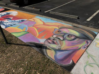
"Chalk Day 1"
This was a collaborative outdoor project that I did with my good friend Will. We were asked to take roughly four hours to design a square on the sidewalk with chalk. Our immediate thought was to do a very colorful portrait, because we both are very good at portraits, and the color of the chalk made the the picture really pop out. We were both really pleased with how this work turned out.
This was a collaborative outdoor project that I did with my good friend Will. We were asked to take roughly four hours to design a square on the sidewalk with chalk. Our immediate thought was to do a very colorful portrait, because we both are very good at portraits, and the color of the chalk made the the picture really pop out. We were both really pleased with how this work turned out.
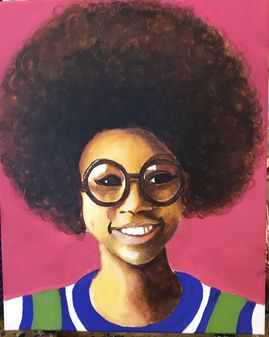
"Adamaris", 2018
This piece was done in acrylic paint, which is what I use most often. She is not anyone I know, but I really loved her style and wanted some experience with painting her curly hair. This piece was very fun for me to do and I am very pleased with how it turned out. The title "Adamaris" is what I chose because the name means graceful and noble. Most of my portraiture pieces have names that mean what I believe that character to be. Her face shows that she is content and her glasses give me a feeling that she is intelligent and ready to change the world. This piece also gave me a lot of experience and knowledge of the color wheel. Many color theories are displayed with the use of complimentary colors.
This piece was done in acrylic paint, which is what I use most often. She is not anyone I know, but I really loved her style and wanted some experience with painting her curly hair. This piece was very fun for me to do and I am very pleased with how it turned out. The title "Adamaris" is what I chose because the name means graceful and noble. Most of my portraiture pieces have names that mean what I believe that character to be. Her face shows that she is content and her glasses give me a feeling that she is intelligent and ready to change the world. This piece also gave me a lot of experience and knowledge of the color wheel. Many color theories are displayed with the use of complimentary colors.
